Music Magazine Front Cover analysis
The mise en sense of this front cover depicts a young man dressed in black covered in piercings, tattoos and a bit of black make-up, these all conforms to the star image that was set up by his record label to make him for successful with his demographic; the demographic of course being punk, the label had fitted him with the latest trendy clothes and piercings this adds a sexual attraction to the equation because the label knows a large majority of the punk demographic are females, it is evident that this a is punk magazine due to the hints of the style e.g the main colour present in the colour scheme is black this connotes a sense of uncanny rebellion and an even deeper self loathing meaning, which ofcourse draws the demographic in, because of that sense of nostalgia and relatability.
The font used in this magazine seems to be a sans serif font it seems that the editors of the magazine are trying to make a strong statement, probably one that only punk fans can figure out; instead of using a serif font the editors had chosen to use a sans serif because serif fonts are too gothic and could be linked into other sub groups of rock such as gothic rock or emo instead of solely being identified as a punk style piece of typography.

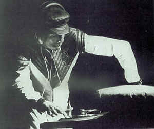 For my Magazine project I wanted to explore with a genere of music that best suits my tpe of personality, I had done some deep soul searching and even performrd and intensive ivegistating into my itunes account; and inevitably found that I am a great alternat6ive rap buff. Must people belive that the only type of rap is "Gangsta" but contray to their belief rap falls into a wide range of different branches; Alternative being on of them. Alternative rap which is sometimes known as Underground rap is a product of the culture of its producers rather than a musical genre itself. The culture of Alternaive rap includes the various arts and strands of tuirntablisim, sampling, producing, vcisual arts, breakdancing spoken and inspirational word andf many more. The style of Alternative rap is primaryly distinguished by the artist themselves whoa are not promoted or monitored by major record lables which bares an uncanny resemblence to the style and production of Indie Rock, this is often because of their experimental style in creating music which could be often tittle unusual by others thus why the style is name "Alternative", many alternative artists use rap as an intrusment to communicate issues with social juistice, global and political change and collective consciousness. Alternative and Undertground beats are often characterized by te unique fusion of loops sampled amd trasfered from different genre s of music such as classical, jazz and even punk. Although many people may associate ligve music with Alternative artist this is invalid because mainstream artist such as J-Kwon use this too, but unfortunately Alternative artist do not reach the same level of finacial success that commercial rappers achive besides trheir work being critically acclaimed.


